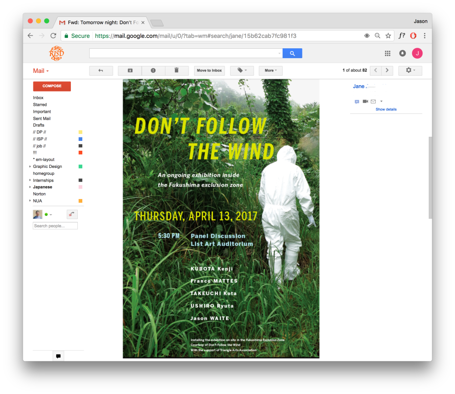
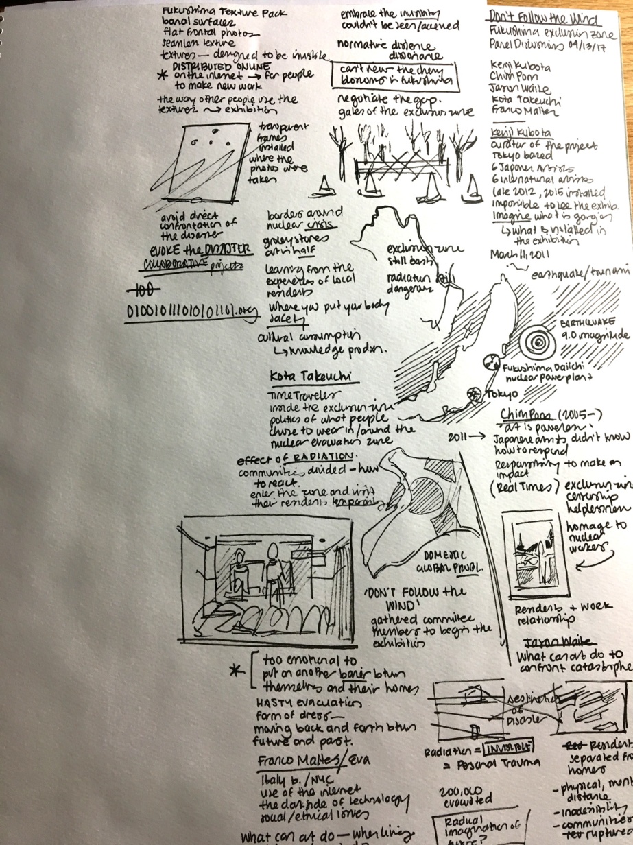
Earlier this evening I attended the first part of a presentation on an ongoing exhibition in the Fukushima exclusion zone in Japan. Jane from Design Agency forwarded me this invitation, and Ron was willing to let me leave class a little early to attend the first part of the presentation. It was really interesting to learn about and see the work the artists are making in response to the 2011 earthquake/tsunami/nuclear power plant destruction and the subsequent release of radiation. The artists discussed how they are tackling the question of “what can art do to confront catastrophe?” and in situations such as these, what is the role of art?
Thousands of people were forced to relocate from the affected area, and the border of the radiation zone itself is very political. The aftermath from the disaster is still evident in Japan today.
The artists spoke about the separation the families are experiencing from their homes and the sense of displacement and separation. “Invisible” destruction—just as the radiation itself is not visible. Gave me some interesting ideas for DP—the relationship to Japanese Internment in matters of displacement and evacuation, the sense of losing one’s home, physical and mental/emotional separation. Very interesting food for thought that I am still processing.
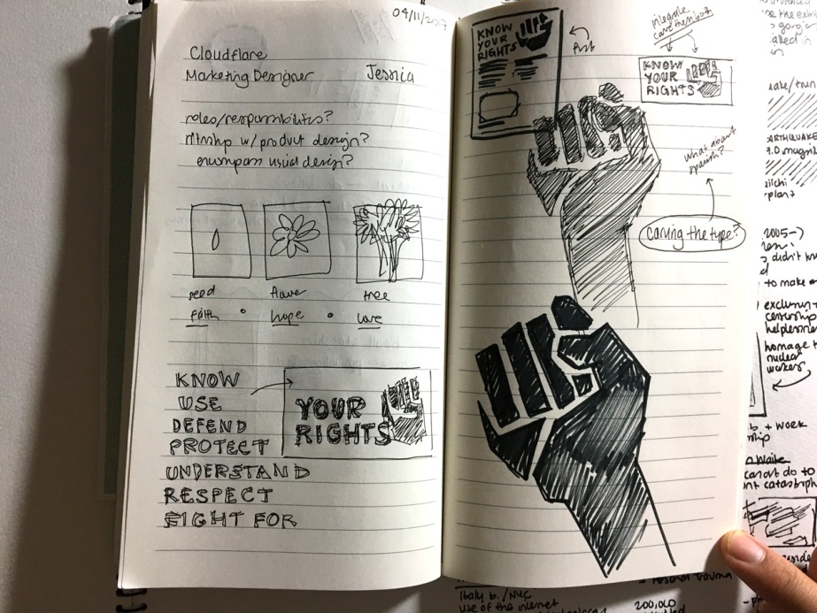
At DIIRI this morning, I received the edits on the KYR packet that Cecily (one of the DIIRI lawyers) had made, and adjusted the pamphlet accordingly. Fortunately, the changes were not too drastic and there were no major additions. I sent the revised copy to Susan to have it translated through Pinpoint, and I also presented her with the Family Preparedness Plan draft 1 I had prepared. Progress seems to be going pretty steadily, but time is moving fast. It will be challenging and interesting trying to incorporate different languages into the design.
Tom mentioned that the guides are very ‘practical’ but could hark more at the ‘poetical’ with an emphasis on what kind of rights are being asserted. And to create a sense of urgency and design that is distinctive from other documents. I am considering carving the type out of linoleum and adding the symbol of a fist. I like the idea of “Your Rights” being carved out, and then maybe having “Know” in black-out typography like the headers in the pamphlet. The word “know” being typeset, can be interchanged with other imperatives: “protect,” “understand,” “assert,” etc. Similarly, for the FPP, “family” and “plan” could be carved. I will give it a shot this week and present it to Tom, and to Brandon and Susan for their opinions and feedback.
Another week flew by. I cannot believe it is Friday tomorrow. After the panel discussion, I had ‘family dinner’ with Bruce and Maria at Ran Zan (with Three Sisters Ice Cream afterwards). This weekend is Easter weekend (meaning tomorrow is Good Friday), and I am volunteering with setup Saturday evening (6–9pm, meaning no homegroup), and with the Easter Egg Hunt after service on Sunday. I have a few job interviews tomorrow and I am hopeful they will lead to something. I know God has a plan.
Quick recap on the feedback from Tom and Andrew this week:
– Tom suggested Ruth and I could each have our own separate narratives created from the postcard series, and then see how we each interpret the works. I emailed Ruth and we were discussing a bit over email. I like the idea of having separate interpretations and a collaborative documentation, or some element that involves us coming together again.
– Tom emphasized the documentary experience, what it means to give meaning through responding to a conversation
– the Faith poster was well-received, minor adjustments/suggestions: to make each perforated unit a circle (mocking the shape of a seed) and to play with the transition of the typography across the poster
– Andrew commented that it is hard for him to critique/comment on the effectiveness of the poster when he understands it coming from a Christian background/upbringing. I wonder how it would be read by someone not Christian and not a designer?
– DIIRI: emphasize the feeling of human rights/constitutional rights; practical vs. poetical
– should be meeting with Do Yun Monday? Couldn’t meet Wednesday or this weekend
I recently finished Luke, and have been reading John. Jesus is a confusing man to follow, sometimes. I wonder if I’d be able to keep up if I had been living and one of his disciples back in the day.
Jesus said to her, “Everyone who drinks of this water will be thirsty again, but whoever drinks of the water that I will give him will never be thirsty again. The water that I will give him will become in him a spring of water welling up to eternal life.”
— John 4:13–14
